How to design a landing page that converts
Some weeks ago, I was working with a client, and she asked me to design a landing page. I had already designed complete and fully functional websites of more than 50 pages, so I thought it would be easy. I have never been so wrong! After spending a week going through dozens of YouTube videos and blogposts, I could finally come up with a design.
It may sound easy, but designing a landing page that actually converts is a real challenge. I don't have enough experience at the moment to give you the secret formula, but I want to share with you what I have learned these past weeks.
In this post I will go through:
- What I understand is a landing page.
- My process to design a landing page.
- The landing page blueprint I am using at the moment.
- Some extra tips.
You may find this useful if you want to design better landing pages.
What I understand as landing page
For me, a landing page is a single web page that acts as a marketing asset and has only one specific purpose. This purpose could be to capture information of people interested in our offer, get people to sign up for a webinar, get people to sign up for a newsletter, etc. A landing page has a very specific target audience and aims to provide value to them in exchange of their "action" (filling in a form, leaving their email, signing up, etc.)
I want to share with you the process that I follow for designing landing pages.
My process for designing a landing page
For this blog-post I asked Google Bard to give me a design brief for a landing page. This is the brief:
- Project Title: High-Converting Landing Page for Online Yoga Class Subscription
- Company: Yoga Haven
- Target Audience: Individuals seeking a convenient and effective way to learn yoga from home.
- Purpose: To generate leads and drive subscription sales for Yoga Haven's online yoga class membership program.
- Key Objectives:
- Increase website traffic and conversions
- Drive subscribers to the online yoga class membership program
- Capture leads and email addresses for nurturing campaigns - Target Buyer Persona:
- Age: 25-55 years old
- Gender: Female, but also targeting males interested in yoga
- Location: United States and Canada
- Occupation: Professionals, entrepreneurs, students
- Interests: Fitness, wellness, health, spirituality
- Challenges: Busy schedules, lack of access to quality yoga classes
- Pain Points: Difficulty finding convenient and affordable yoga classes, feeling overwhelmed by the number of yoga options available
- Desires: A structured and guided yoga program that can be done from home, a supportive community to connect with, and the ability to learn and practice yoga at their own pace. - Visual Style:
- Modern, clean, and minimalist design
- Use of calming and soothing colors, such as pastel shades and earthy tones
- High-quality images and videos showcasing the Yoga Haven studio and yoga classes
- Testimonials from satisfied customers
So, I started with the process:
1. Planning
To come up with a good design, the first thing we have to do is understand really well the goals of the landing page and the target users. This is why I always start by filling out this template and answering the following questions:
- Purpose: Generate subscription sales for Yoga Haven’s online yoga membership
- Buyer personas: People interested in fitness, wellness and spirituality with busy schedules that want to practice yoga.
- Buyer persona pain points: Difficulty finding convenient and affordable yoga classes, feeling overwhelmed by the number of yoga options available
- Buyer persona desires: A structured and guided yoga program that can be done from home, a community to connect with, and the ability to learn and practice yoga at their own pace.
- Clear and singular benefit: Learn yoga from home at your own pace.
- Why should they sign up now?: They will get a 2-week free trial if they sign up until the end of the week.
- What is the social proof?: Testimonials, Reviews, number of active members
- What is the CTA, is it clear?: Start your free trial today!
- What are we giving away for instant gratification? Access to the platform and community.
- Information that we want from the customers: Name and Email
- What are we doing with it? Add them to the database and send an email with the information to access the platform.
Once I am very clear about the expectations, the target audience and what I want to achieve with the design I can go to the second step.
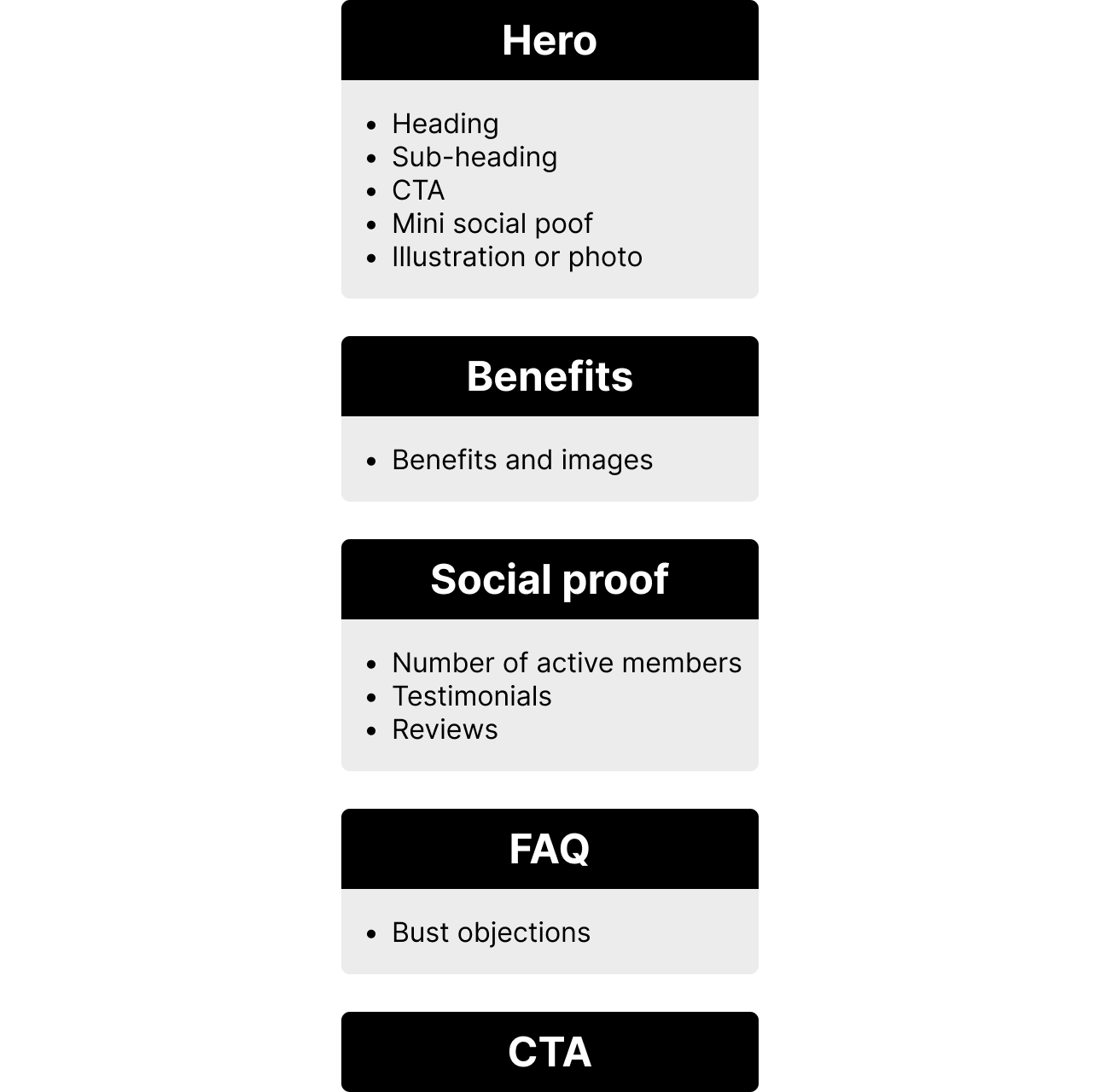
2. Page Layout
For this step I follow the blueprint I will share with you later. A layout is a structure for the sections and content we want to include in the design. This helps us organize our ideas and set up guidelines for writing the copy afterwards. For this example, I decided to use this layout:
Now that I had a structure and ideas about what I would like to include on the page, I started writing the copy.
3. Copywriting
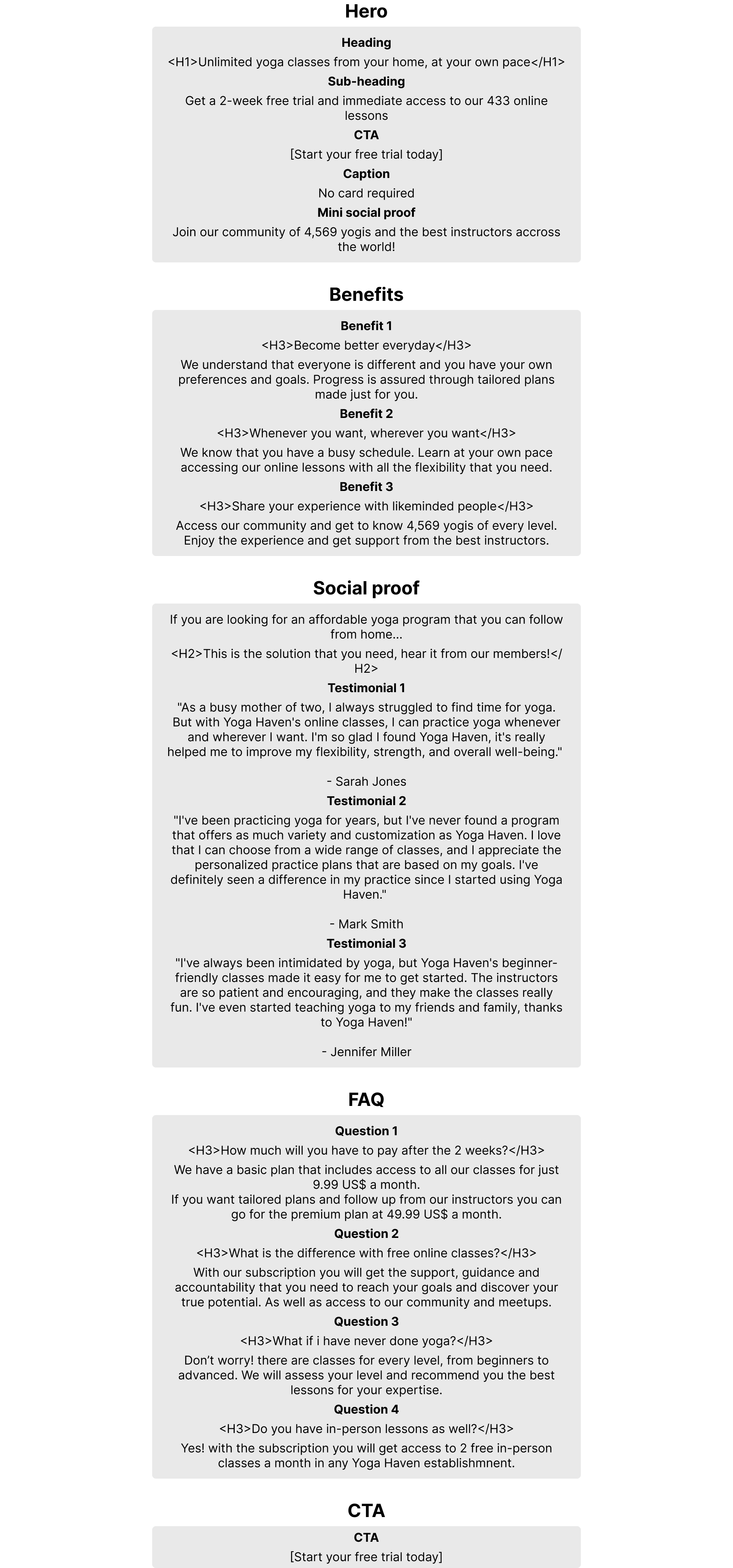
This is one of the most important parts of the process. Writing a copy that actually connects with the target users, hit their pain points and addresses their desires is huge for improving conversion. This is the copy I came up with:
Once I had the copy, I started thinking about the design.
4. Design
For the design, I started looking at some inspiration on Pinterest. Once I got an idea of what I liked, I sketched some wireframes:
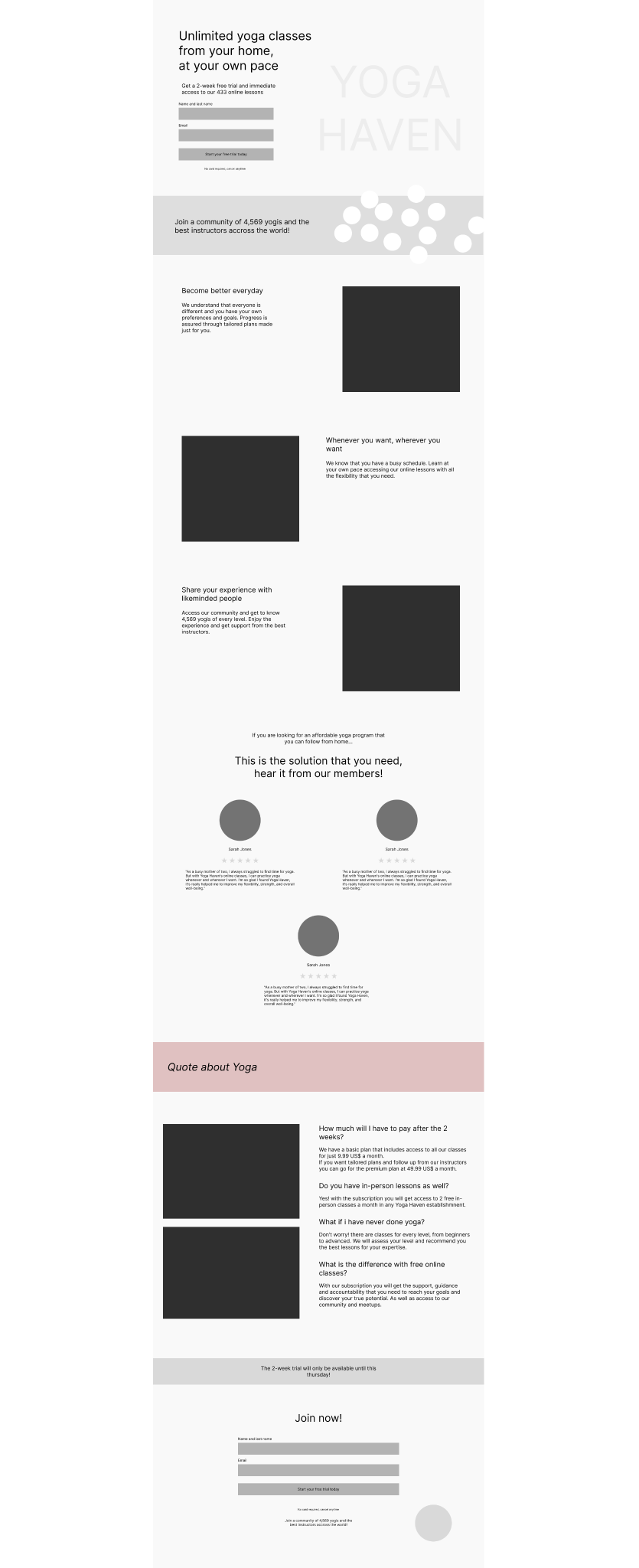
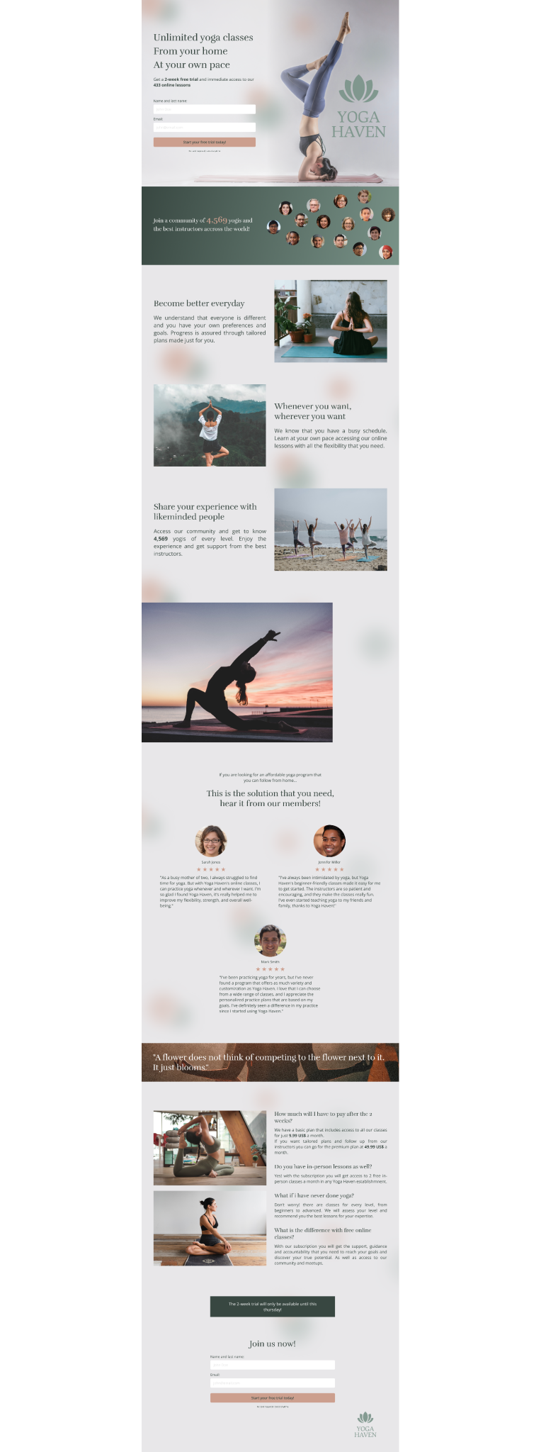
Then I added some color and high quality photos from Unsplash. This was the final design:
5. Tracking results
Since it wasn't a real project, I didn't get to launch the page, but this is a very important step if you are working on a real brief. I would suggest setting up Google Tag Manager, as well as a lead capturing system. That way you will be able to know the analytics and monitor the traffic and conversion rates. I will not go into detail because I don't have enough experience in this, but A/B testing is one of the best tools to determine success and constantly improve conversion rates.
My landing page blueprint
This is the blueprint that I am following for designing landing pages:
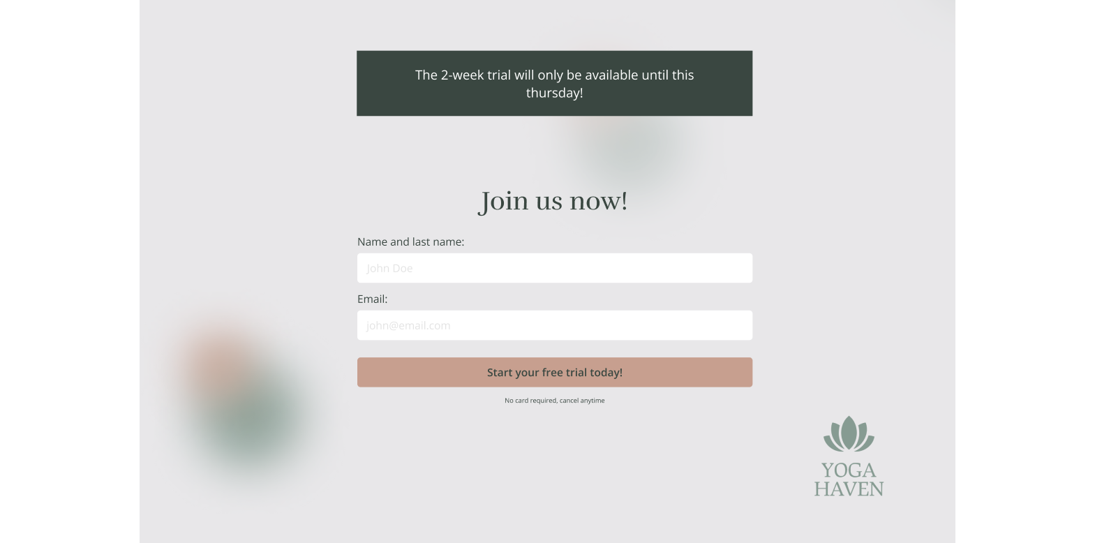
1. Hero section
This section is the first thing that the users will see, and maybe the only thing. So it is important to state a clear value proposition and tell them what they will get:
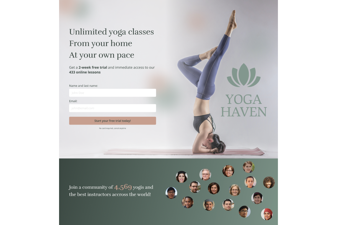
These are the elements I include in the Hero section:
- A headline that emphasizes value, result or transformation.
- A sub-headline that call out the actual thing and explains what you provide to get the result.
- A clear CTA.
- An Explanation of what happens if they press the button.
- A little text to build trust besides the button.
- Some social proof.
- An illustration or photo of people enjoying the thing.
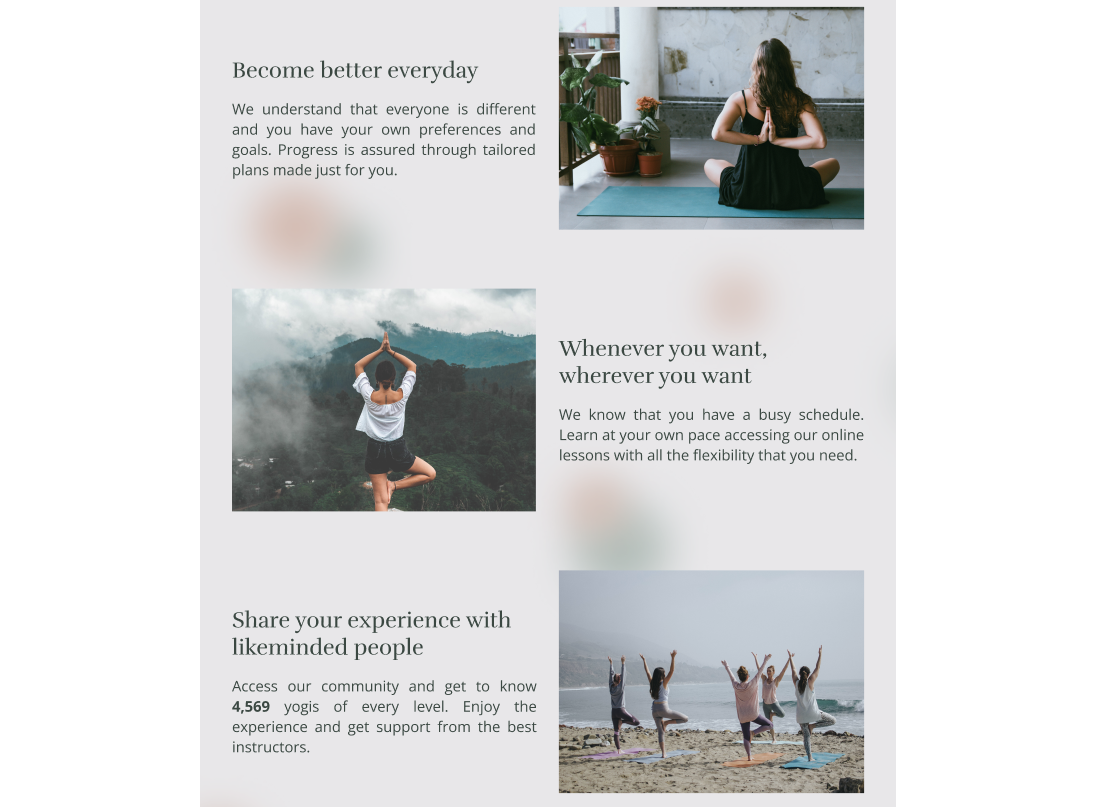
2. Benefit section
For the benefits section, I would start by looking at the features and then asking why would people care about it. This way, we can transform them into benefits and address the pain points and desire connecting better with the audience. sing images and illustrations can help the audience understand the benefits better.
3. Social proof
This section is a must, showing social proof and creating trust is a necessity. The audience will know that it is a good solution if other people tell it. This is why I used testimonials showing specific results or outcomes:
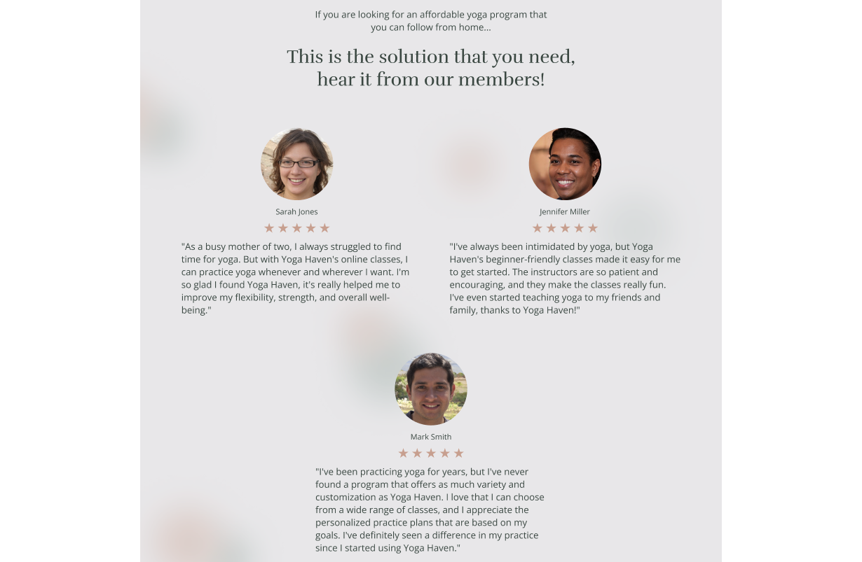
It is also a good idea to use stats or logos of well known companies if we are designing a landing page for a B2B client, for example.
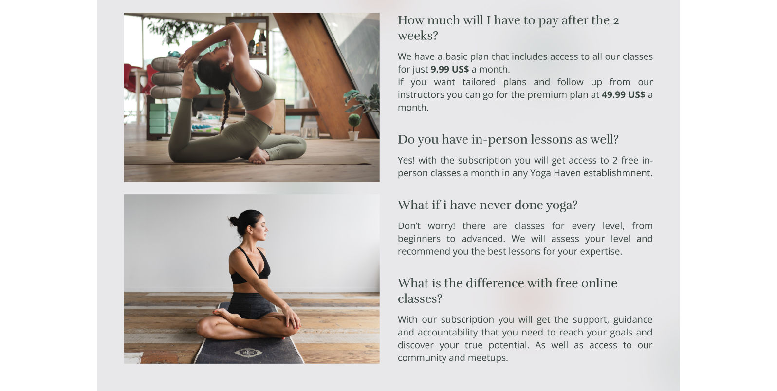
4. FAQ
This section is specially dedicated to busting common objections that the target clients can have regarding our offer.
For example :
- It is too expensive.
- I dont know if I will get results.
- I am not sure if it is worth it.
- I wont have time for it.
These are some objections we can address and reframe into answers to solve the possible doubts of our audience.
5. Direct CTA
Finally, we should close the page with a direct call to action stating really clear what we want from the audience.
Some extra tips for designing landing pages
1. Don't include navigation
When we are designing a landing page we don't want to distract the users from the main task. If we want them to press a button, then that should be the only option available. This way, we can increase conversions.
2. Use scarcity and urgency
These concepts are key in copywriting and, maybe you have heard about them already. Scarcity means that the demand is greater than the supply. Urgency means that the user must take action immediately. If we manage to use these two concepts while being honest about it and avoiding exaggerations, we will be able to persuade the users to convert.
3. Use instant gratification
An example of this could be offering the users immediate access to a feature or exclusive content. Something that they want, and we can provide immediately after they leave their information. This will increase conversion rates and provide a good experience for the users. As you can see, there is a lot to think about when designing a landing page. Please let me know if you follow a different process or blueprint.
I hope this is useful for you!